BRAND STRATEGY + CREATIVE DIRECTION + DESIGN
Atlassian Jira Software Campaign
Design Lead for Jira intergrated marketing campaign targeting tech knowledge workers. Longest-running Jira IMC to date, delivering results 792% above goal at launch.
Outcomes at a Glance
5+ international markets performing strongly
792% above eval goal at launch
219.8% above entrances goal
147% entrances vs. adjusted goal (Feb 2021)
The Challenge
Atlassian is a software company that develops products for software developers and project managers. This integrated marketing campaign focused on Jira Software. I served as lead designer and was responsible for design and art direction ideation through completion.

Objective
To drive new customer evaluations and adoption of Jira Software Cloud among non-developer technical professionals (e.g., Product Managers, Project Managers, Scrum Masters).
Strategy
Developed a user-centric integrated marketing campaign to address the unique pain points this audience faced in 2020.
Focused on strengthening Jira's brand identity as a problem-solving work management platform for technical teams.
Success Metrics
Primary KPI: Increase in product evaluations. | Secondary KPI: Growth in new user entrances.
Initial Concepts
Presented three potential visual directions to PMM stakeholders based on user-centric research and creative brainstorming
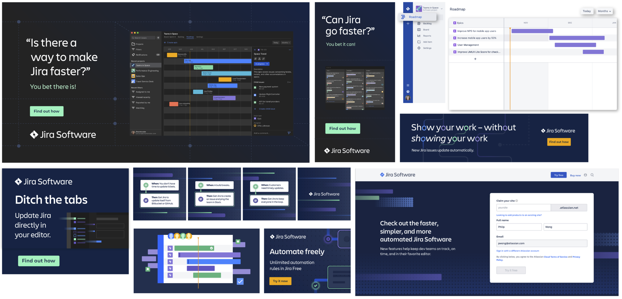
Concept 1: Developer Love (The Safe Bet)
The Hook: A natural, self-aware evolution of our highly successful Q1 “DevLove” campaign, leaning into a dialed-up, wink-and-nod tone that sits comfortably within the existing Jira brand.
The Tension: While a tried-and-true approach, we had to ask: Does this feel distinct enough to capture the unique pain points of non-developer knowledge workers, or does it feel like more of the same?
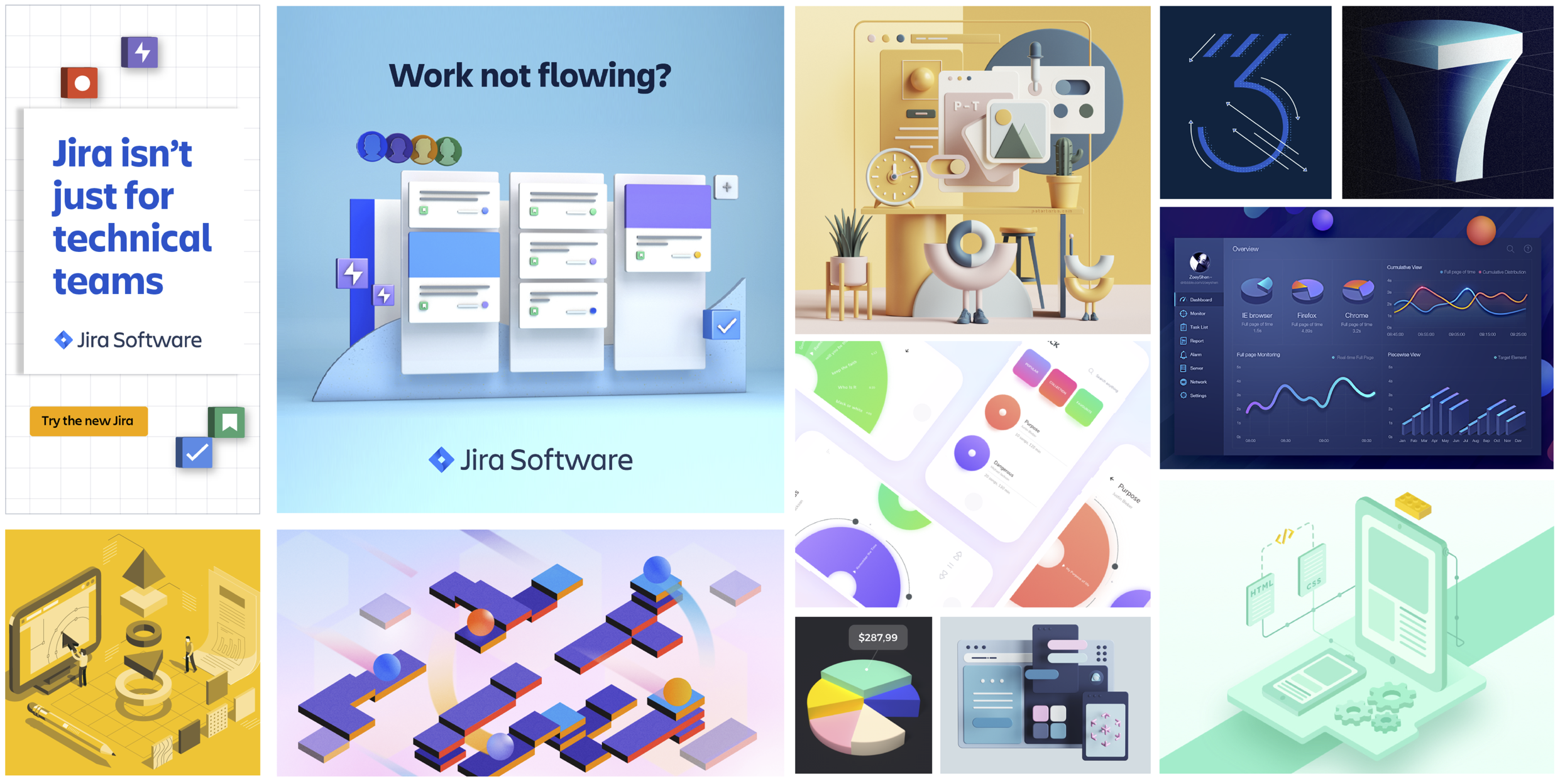
Concept 2: Oddly Satisfying (The Aesthetic Pivot)
The Hook: This concept shifted the narrative from “pain points” to “aha moments”—the satisfying, effortless feeling when work just flows. It leaned into a modern, monochrome color palette and a 3D aesthetic, representing a new and unexplored visual direction for the brand.
The Tension: As a significant creative departure, the key question was: Is a campaign focused on positive feelings strong enough to motivate action? And would this softer, more abstract aesthetic resonate with a technical audience, or was it too far removed from Jira's established brand identity?
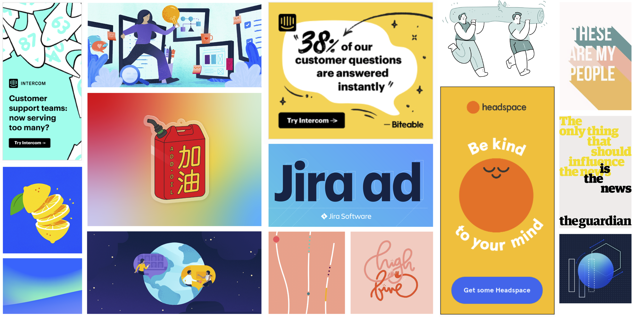
Concept 3: The Empathetic Anchor (The Human-Centric Solution)
The Hook: This concept positioned Jira Software as a “helping hand”—a warm, reliable, and trustworthy platform for PMs navigating a uniquely stressful year. The strategy was to offer a message of simple, friendly support in a chaotic world, brought to life through bright, bold brand colors and approachable illustrations.
The Tension: The critical question was one of perception. In a market that values power and functionality, would a campaign centered on “friendliness” be seen as a compelling benefit? Or would it risk under-selling Jira’s robust capabilities and being perceived as too simplistic for a savvy technical audience?
Visual Direction + Formula
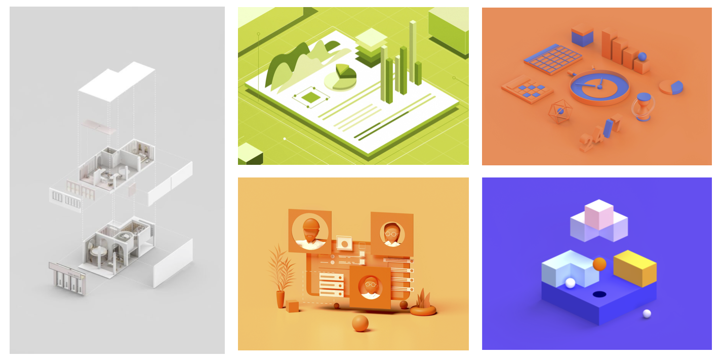
Comforting / Oddly Satisfying with the goal to spark joy among the technical knowledge worker audience by speaking to the unexpectedly satisfying moments one experiences when using Jira Software features
Tactile 3D UI
Visually and emotionally satisfying through feature rich UI elements
Organization
Cultivate a of ease, interactivity and feeling that everything fits together just right
Abstracted UI
Secondary abstracted low fidelity UI elements set in layered planes
Monochromatic
Refreshing monochromatic color palette with intentional pop of complementary color
To keep the timeline on track, I developed a 2D-first workflow to lock all compositions and UI placements before production. This critical step forced a strategic evaluation: was 3D the most effective medium for this audience and our goals?
Product References
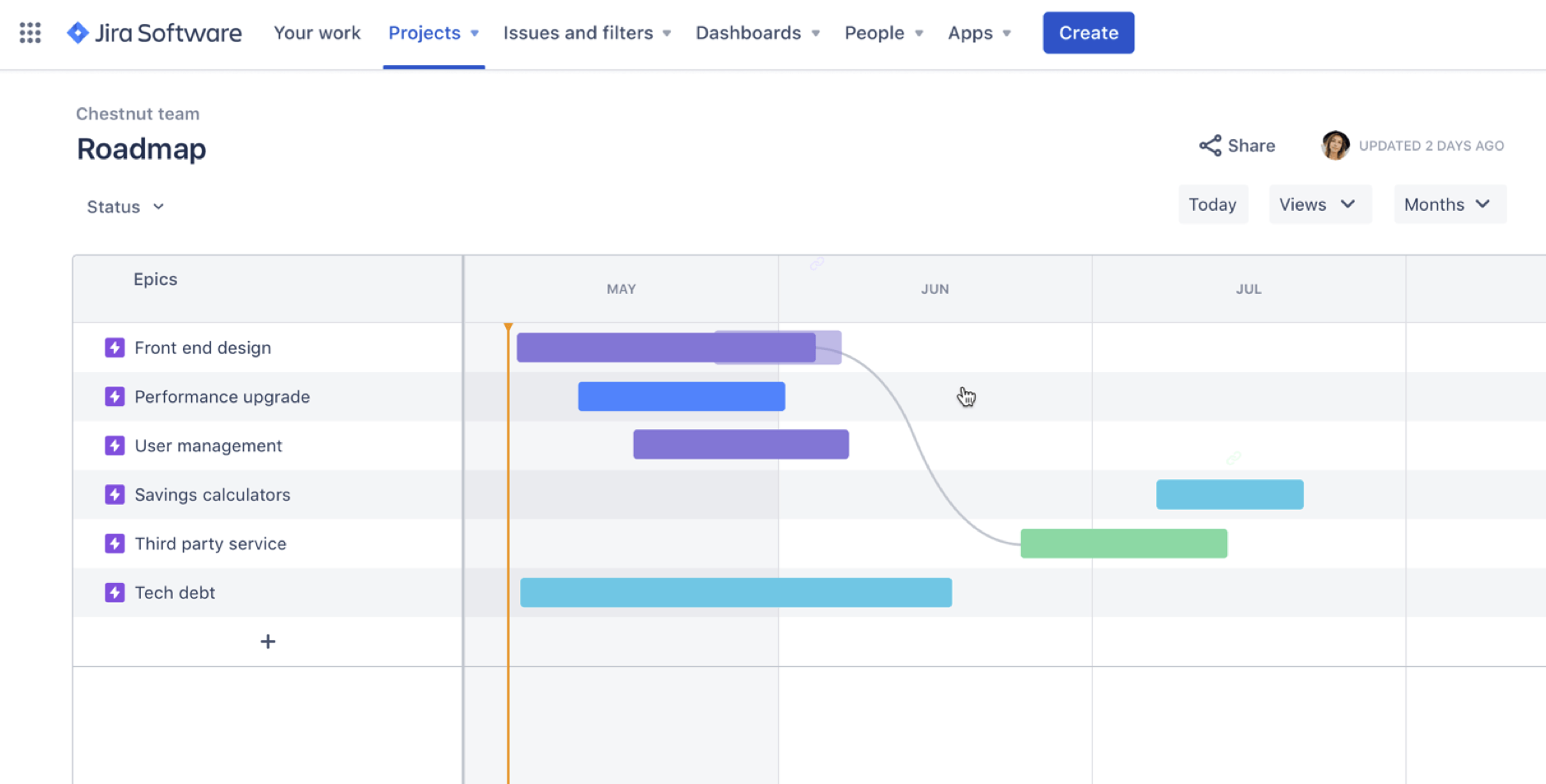
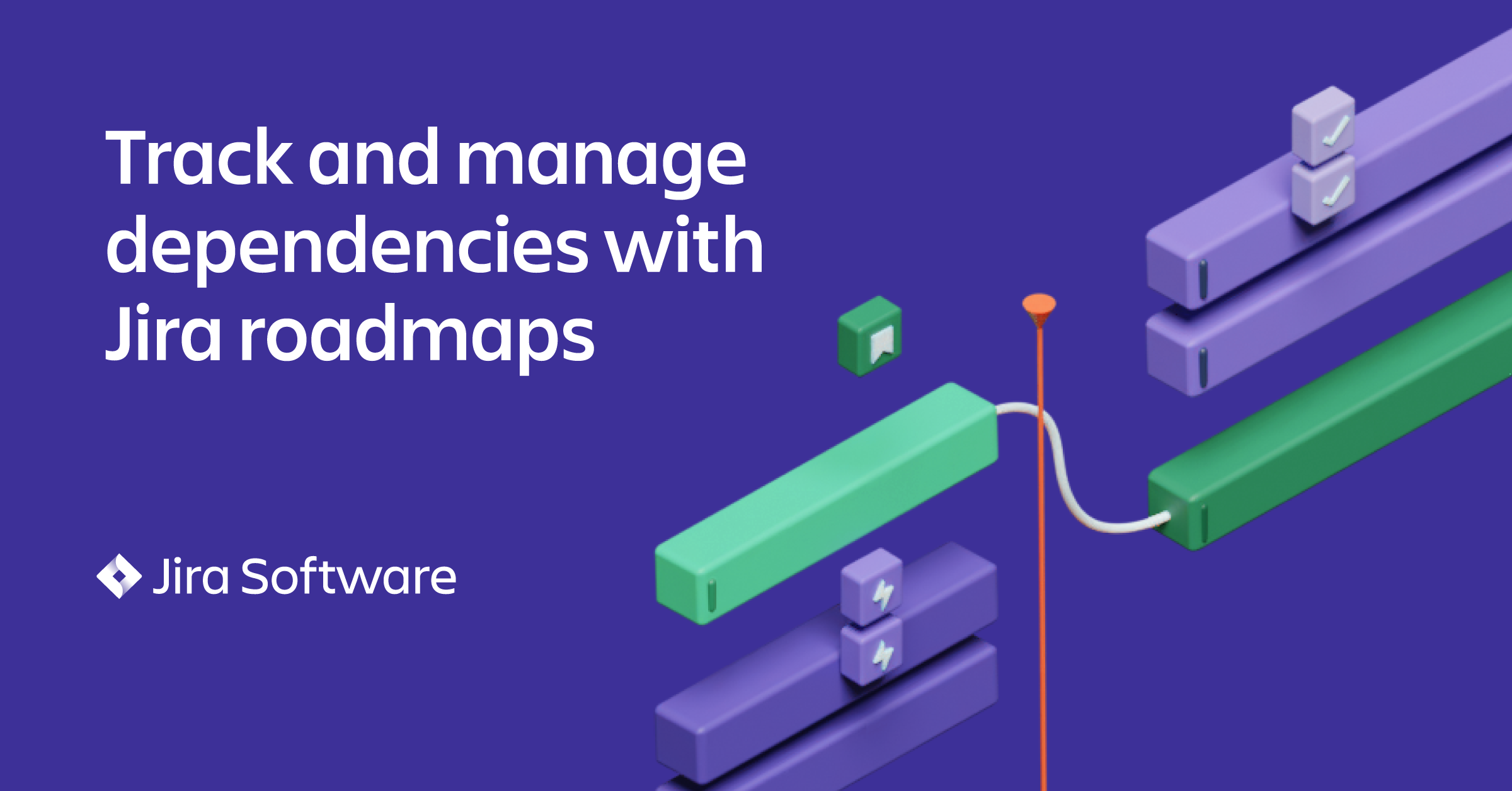
Roadmap your way out of the chaos
Roadmap bars
Dependencies and epics / sub-tasks shown as secondary elements
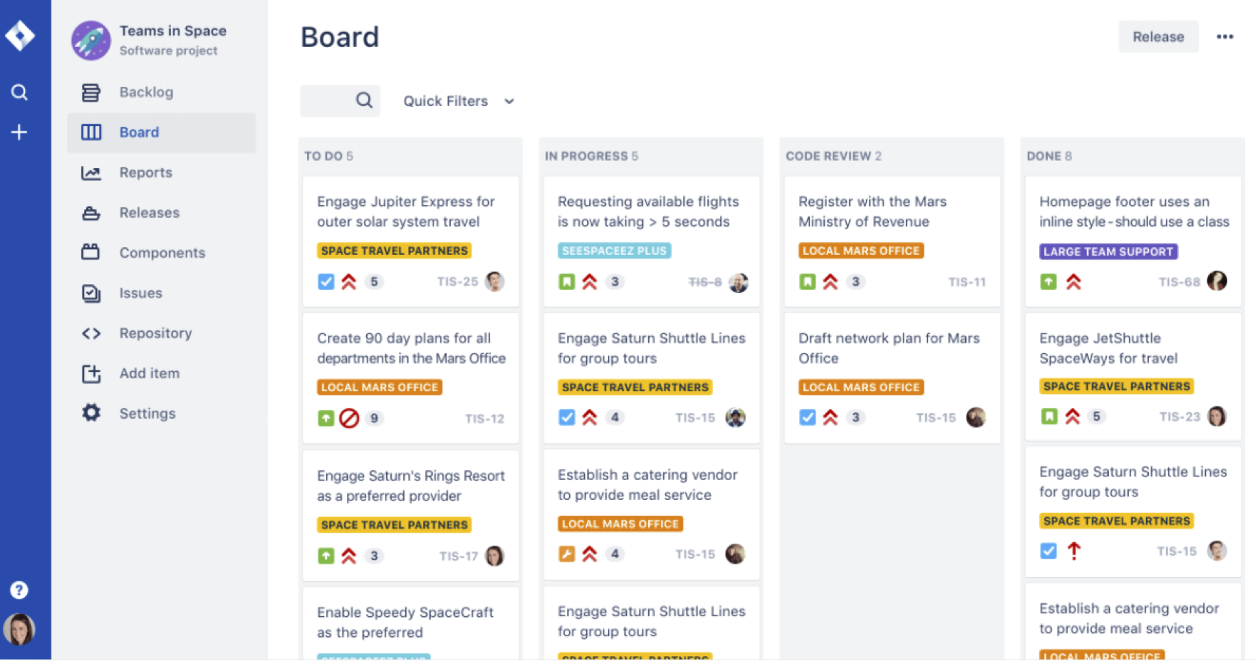
Trust: The Jira Imperative
Intangible quality with Jira board familiarity
UI icons, screen, or stats with satisfying arrangement of visual elements
Know and share the value of your work
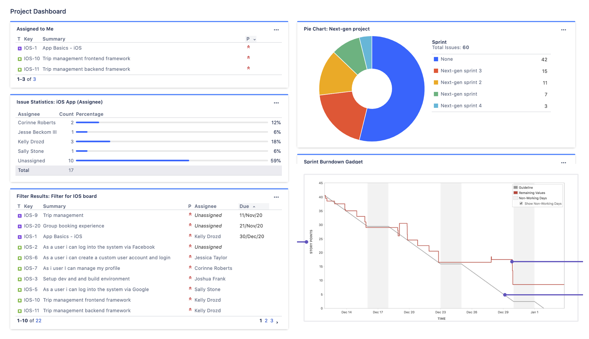
Burn down charts
Shown with guideline and other small chart elements
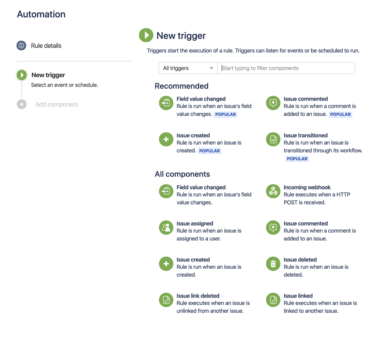
Automate your team’s peak new normal
Build from previous creative around the connectivity of items / icons
Rule builder elements
3D Material Explorations + Compositions
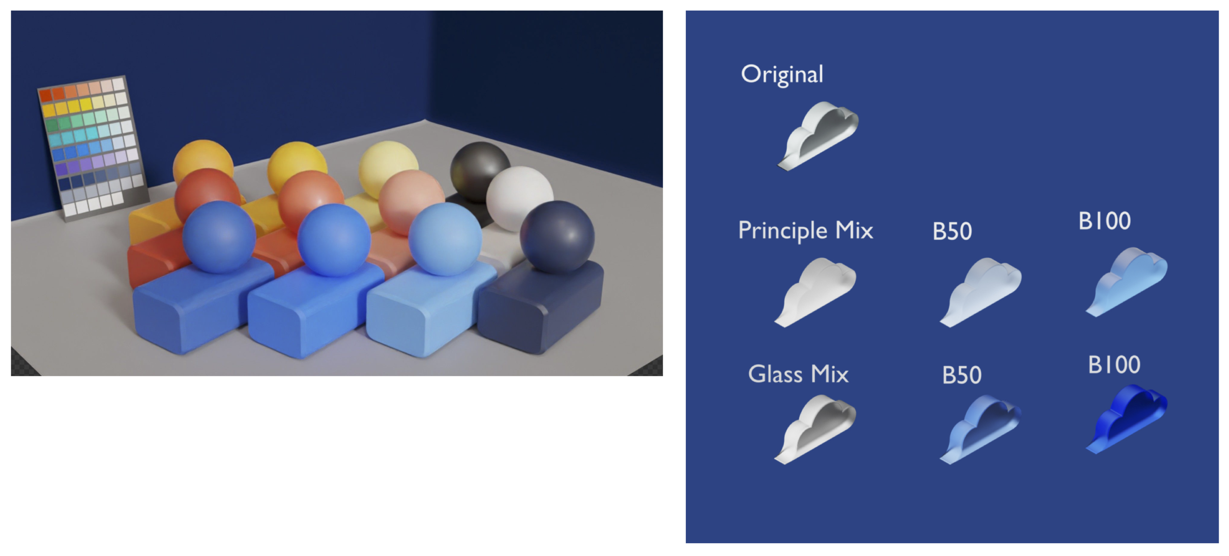
When designing in 3D, materials, color, and lighting must be determined as part of the visual language. Below, our motion designer translated Atlassian brand colors across a play-doh sculptural material with chunky, rounded corners. Additionally, created a transparency exploration of acrylic and lighting mix.
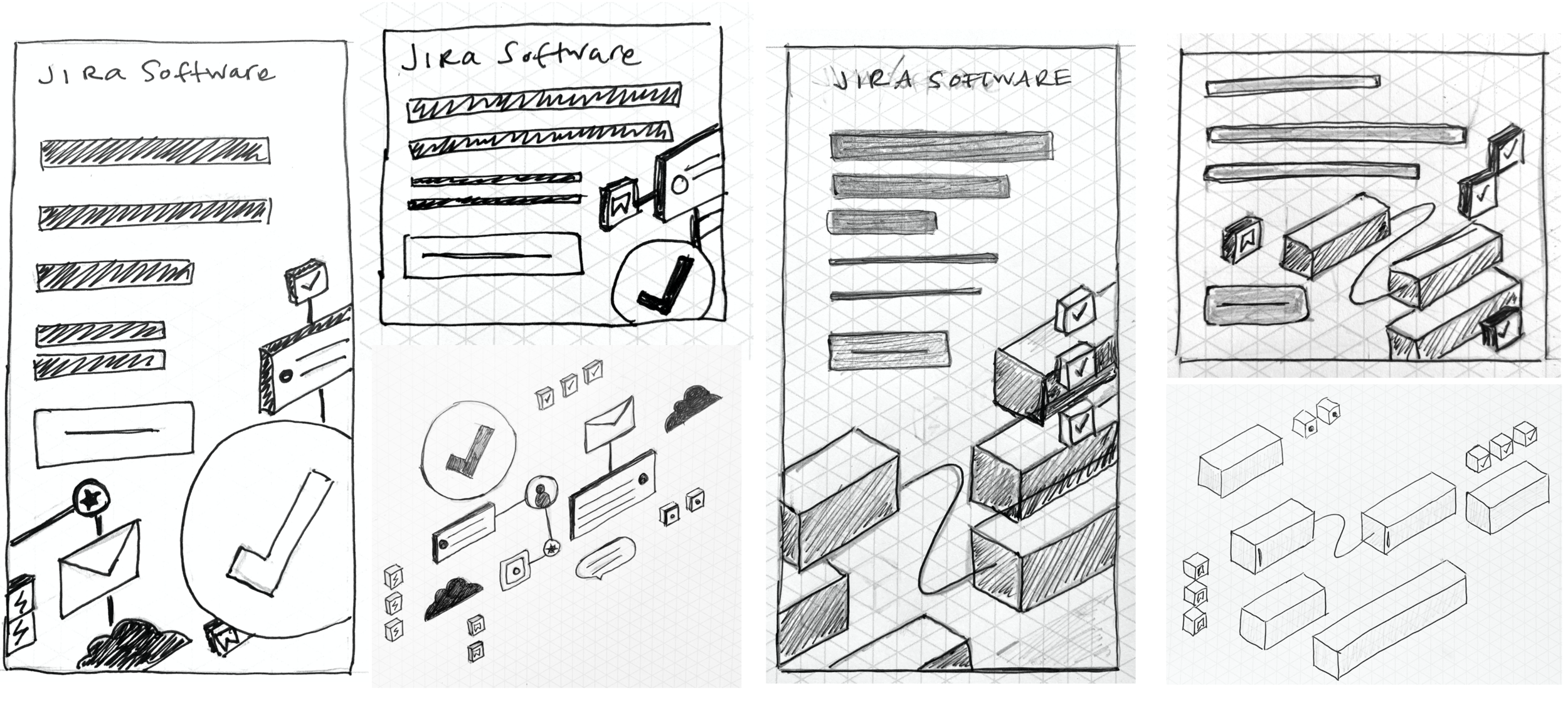
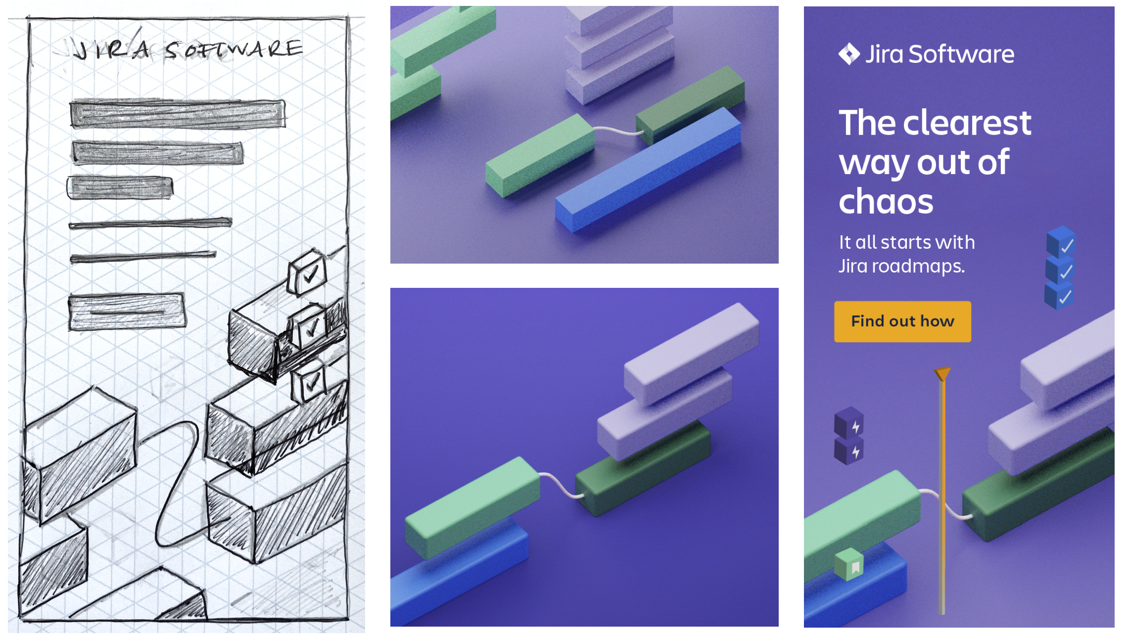
Mid-fidelity sketches for Automation and Roadmaps, as well as initial Blender render explores with a grain texture to enhance the tactile, satisfying dynamic
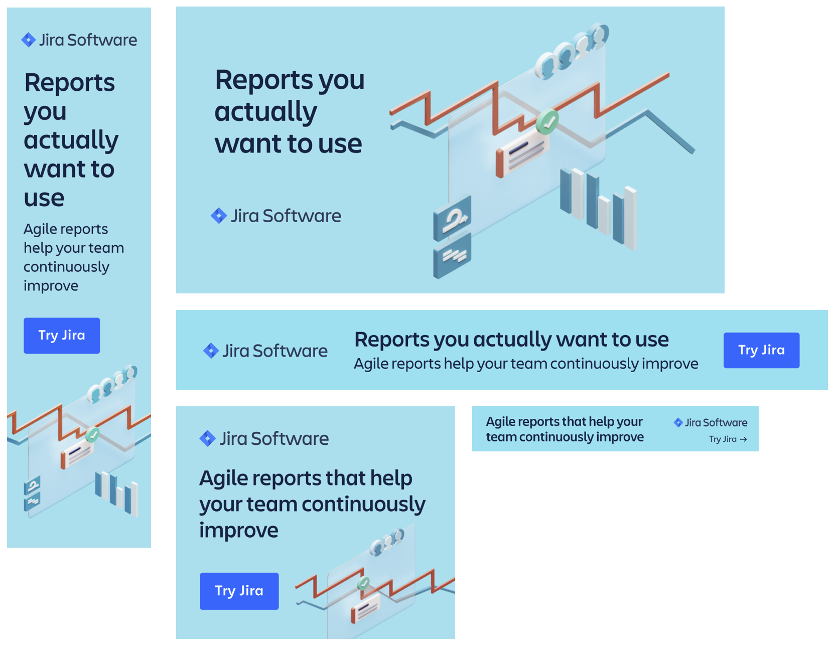
Reporting Deliverables
Roadmaps Deliverables
Automation Deliverables
Trust Deliverables
Campaign Performance
Launched early December 2020 continues to see strong performance into April 2021. Evaluations (signups) are the primary metric for this campaign with Entrances (number of page visits) as secondary metric.
Initial metrics were significantly over performing goal (792% above eval goal and 219.8% above entrances goal)
Increased ad spend 150% from January to February 2020
An adjusted baseline was established early February by Performance Marketing to account for a new ad type that was resulting in January’s over performance
Adjusted baseline shows Entrances: 147% of goal for February 2020
As of February 2021, the campaign showed strong international success in Australia/New Zealand, Spain, India, Russia, and UK and stands as the longest running Jira IMC.
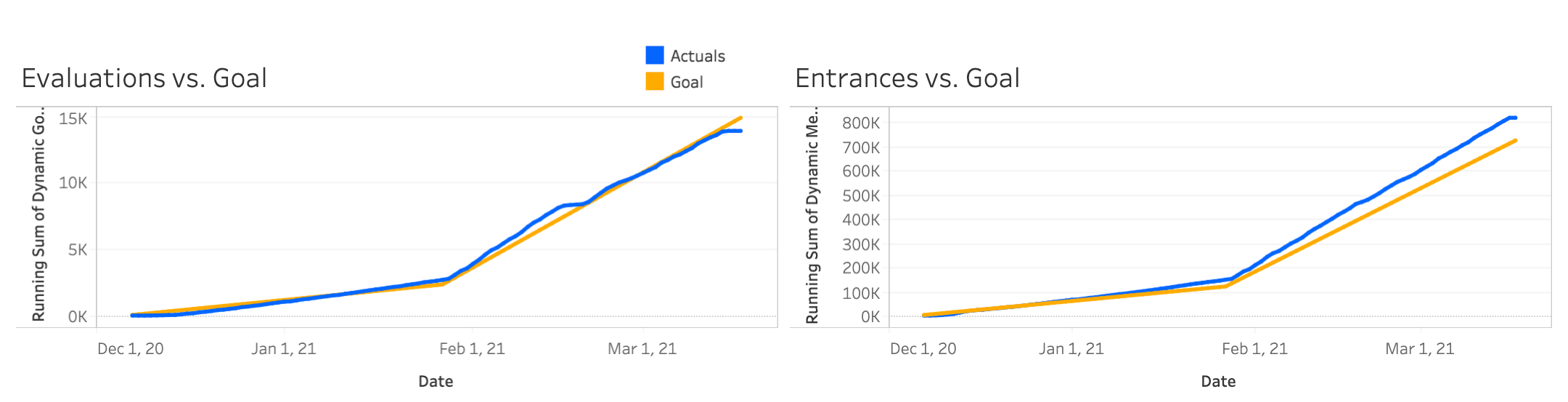
Performance from December 2020 through March 2021
Performance from December 2020 through March 2021